Link to the hosted Simple Form page.
We'll show you how to recreate this demo in a simple HTML page to give you a sense of the development process.
Choose between two convenient methods for inclusion:
Add a couple of lines to the header of your html to enable the web page to consume the Unified UX library.
- Include the JavaScript library by referencing the single minified JavaScript file.
- Style your web componenent using the Temenos Design System by linking to the 'base.css' style sheet. We've hosted both on our website for convenience.
That's it. You are now able to add Unified UX web components to your HTML page to create a form.
Alternatively, include UUX as an NPM module within your app as detailed in NPM Hello World Tutorial.
Warning: Take care not to use BOTH methods as this will cause a double registration error.
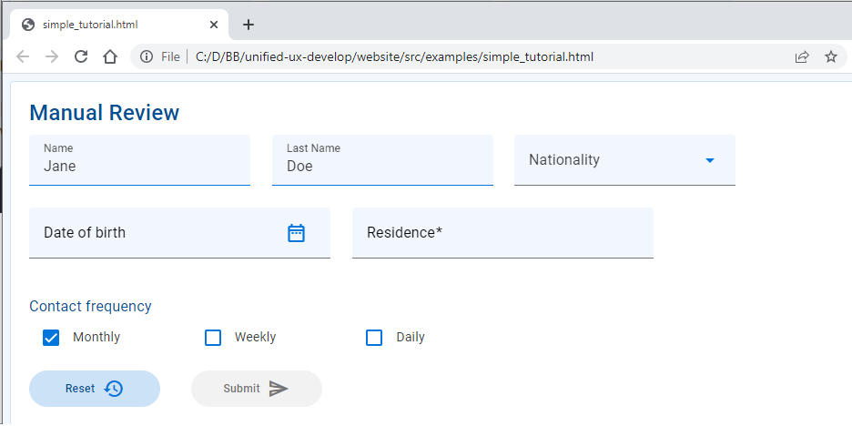
We'll add a Card to the body of the web page to contain our form elements. This will show a single contained unit on the page and will help visually group the items that we add next.
The Card web component has built-in properties such as 'heading' that you set up for your particular instance. There are also built-in style variants that utilise the styles defined centrally for the organisation in the Temenos Design System.
We'll use heading 1 for our 'Manual Review' heading.

Now we'll add some form elements into the card. The Unified UX web component library has a suite of form elements ready to go. They implement the modern look and feel of the Temenos Design System and extend Google's Material Web toolkit.
We'll add a selection to our card to see how they look. The properties of all our web components are documented on the code tab of their respective documentation page so you easily see what the available options are.
- Text Field- These text input controls animate when they get focus and can show helper text below the control, if provided. We'll use them for Name, Surname and Residence. To pre-populate a field, just set its value.
- Select- This single selection dropdown allow the user to choose from a list. The list items are created as child items in this component
- Date Picker - An input with a pop-up calendar or text input. Try typing in an invalid date and see the built-in validation triggered when the input loses focus when you tab out of the control or click elsewhere.
- Text- this component enables you to use styled text to your page for things like subheadings.
- Checkboxes- these components can be placed as standalone inputs on the form or you can choose to use them in a group.
- Buttons- buttons allow users to take actions, and make choices, with a single click or tap. We'll use them to allow users to reset or submit the form.
All our web components have the uwc- prefix (namespace).
You will notice that the components render vertically down the page. This is how they layout by default, and a layout grid is required to achieve something more sophisticated. We'll see how to do this in the next step.
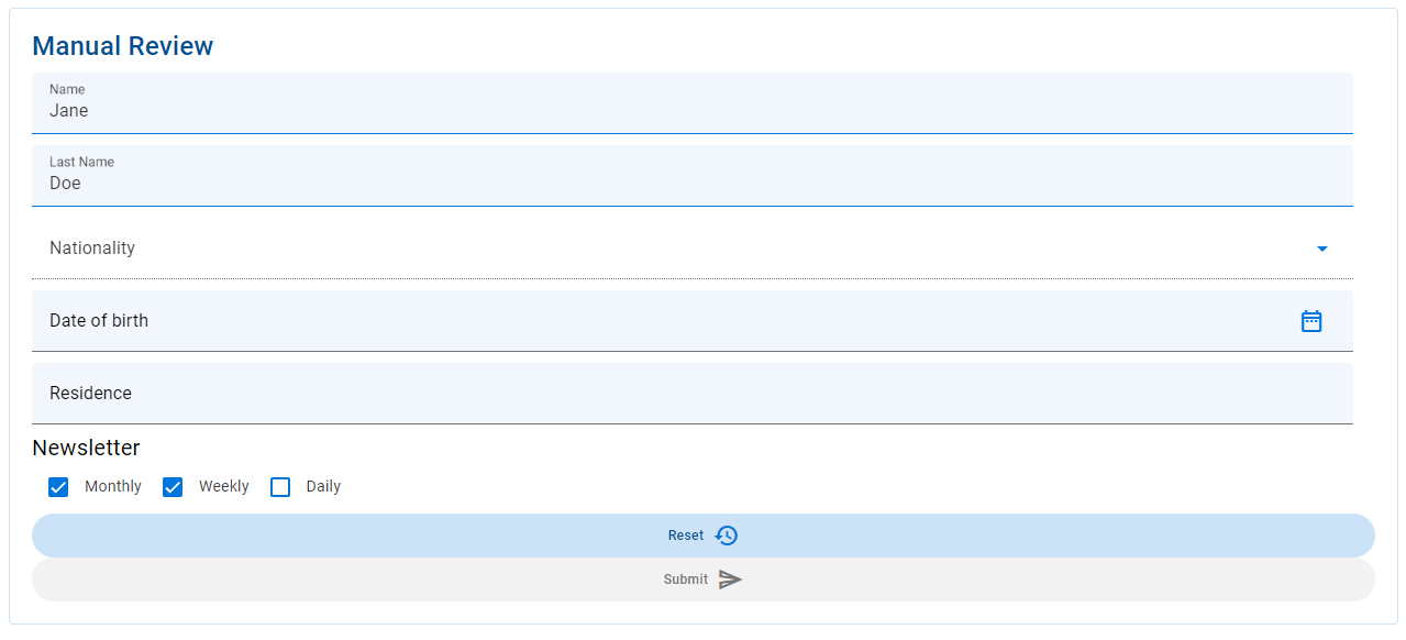
Next we'll add a grid into the card. Grids help ensure good component layout by ensuring that changes in screen size are responded to gracefully, so your UI design always looks great and performs well. Try resizing the browser window on the demo page - see how the form elements reorganise themselves? That's the grid at work.
The Grid allows you to define how the layout of components should adapt for different supported screen sizes and orientations, and is based on a 12-column grid.
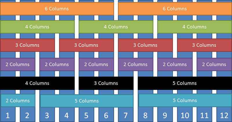
Firstly, add a grid container to create your layout in. Then wrap each input component in a grid component to specify how many columns of the grid it should. Children of the container will be rendered as columns of the grid.
So, using the above structure with the web components placed into the grid structure we can put it all together to get a nicely laid out screen.
We use a very simple example here, and if you'd like to learn more about using the grid to control spacing, responsiveness to adapt the layout for different screen sizes and nesting grids for more complex layouts, check out the Grid Demo which showcases the concepts.
- Add event handlers
- Form submission