Link to the hosted Bigger Form page.
Much of the basics has been described in the Simple Form. All we have done is added more fields.
In this chapter, we'll show you how to use the grid to make the form responsive. There are 4 responsive sizes, Extra Small (xs), Small (sm), Medium (md), Large (lg).
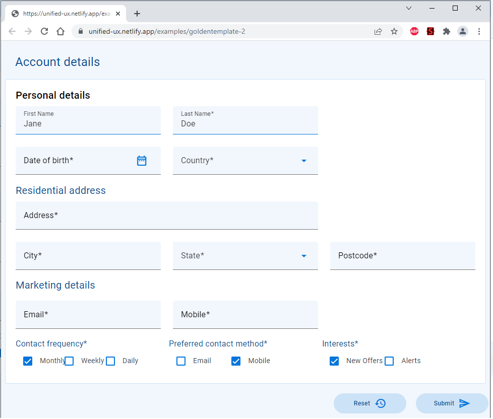
The screen shot above shows the Large layout. It basically has 3 columns, most of the right hand column is blank.
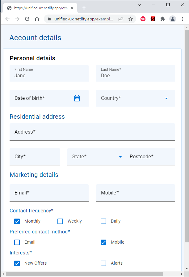
Here you can see the right most column has been removed and the 3 visible columns are smaller.
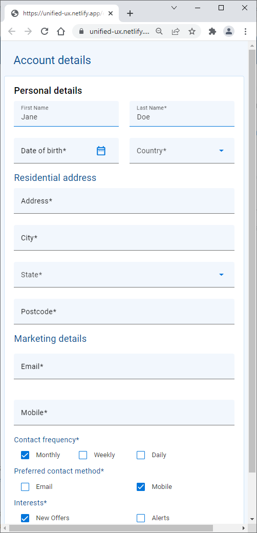
Here you can see most of the form now fits into one column. Where there was more than one column, there now wrap to the next line and show most items vertically.
Here we show only a subset of the full functionality of the grid, mainly how to configure it for responsive. You will already have seen in the previous example Simple Form the basics of constructing the grid.
Grids help ensure good component layout by ensuring that changes in screen size are responded to gracefully, so your UI design always looks great and performs well. Try resizing the browser window on the demo page - see how the form elements reorganise themselves? That's the grid at work.
- A grid typically has container element encapsulating 3 grid items. Here we see a grid with up to three columns available. This when resized can drop to 2 columns and even to one column depending on the numbers.
- The magic number is 12, all columns need to add up to 12. If the number is greater than 12, that field will wrap to the next line. If the number is smaller than 12, then other grid attributes take hold to position the cells, e.g left justify, centre, etc.
- To have 3 columns, the lg and md responsive layouts need to use up 4 grid cells for each column.
- To have 2 columns, the md responsive layout uses 6 grid cells to hold each column. The 3 column is set to zero, to hide it.
- To have 1 column, the field has to occupy all 12 grid cells.
The "Address" field has 2 responsive layouts. One for xs and sm, and one for md and lg.
- When in xs or sm, it will occupy the full width of the screen, hence it needs a value of 12 to signify that it want to take up all 12 grid cells. The blank column is set to zero to hide it.
- when in md or lg, it will occupy 2/3 of the screen, leaving the right most column blank. So we set the field to occupy 8 grid cells and the blank column to occupy 4 grid cells, a total of 12.
The "city", "state" and "postcode" fields would occupy 3 columns in all but xs where it occupies one column.
- xs is set to 12 to occupy the whole width, this forces the next field to take the next line. Since that too is set to 12, it occupies the whole width, similary for the 3 field. Hence we have 3 fields all stacked on top of each other.
- for the remainder layouts (sm, md, lg), we decided to leave them occupying 3 columns. Hence they are given 4 grid cells each. Basically 1/3 of the screen.
Quite often, there is a need to change the page dynamically and/or to interact withthe user. We will show some javascript to make some modifications to the screen.
- Add some data to the "Address" field.
- Make the "Address" field read-only.
First we add some id's to each element
Then add the javascript
Finally we assign this buttonClickHandler to a button
When you click the submit button...
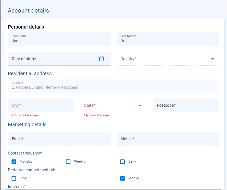
See the fields with red error messages and the address field now has some data.
- Add event handlers
- Form submission